camera identify
Try for Free
tab list
PictureThis
PictureThis
Search
Search Plants
Try for Free
This page looks better in the app

How to Use Color Theory in Landscape Design: Painting Your Garden with Nature's Palette

Unveil the secrets of using color theory to give your garden an aesthetic boost, utilizing nature’s palette to create a picturesque landscape.
Rectangle Frame
Line
Unlock the transformative power of color theory in landscape design, creating an enchanting and vibrant outdoor space that reflects your unique style and appreciation for nature's bounty. Harness the full spectrum to paint your garden with an intelligent use of color.
Rectangle
Fundamentals of Color Theory
Color theory is a fundamental aspect of landscape design that can transform your garden into a work of art. By understanding the principles of color and how they interact with each other, you can create visually stunning and harmonious outdoor spaces. In this section, we will explore the basics of color theory and its application in landscape design.
One of the first things to understand is the color wheel, which is a visual representation of how colors relate to each other. The color wheel is made up of primary, secondary, and tertiary colors. Primary colors, namely red, blue, and yellow, cannot be created by mixing other colors and are the building blocks of all other colors. Secondary colors, such as orange, green, and purple, are created by mixing two primary colors. Tertiary colors are made by mixing a primary color with a secondary color.
In addition to understanding the colors themselves, it is important to be familiar with concepts like hue, saturation, and value. Hue refers to the specific shade of a color, for example, whether it is a bright or muted version of blue. Saturation refers to the intensity or purity of a color, with fully saturated colors appearing vibrant and pure, while desaturated colors appear more muted. Value, on the other hand, relates to the lightness or darkness of a color.
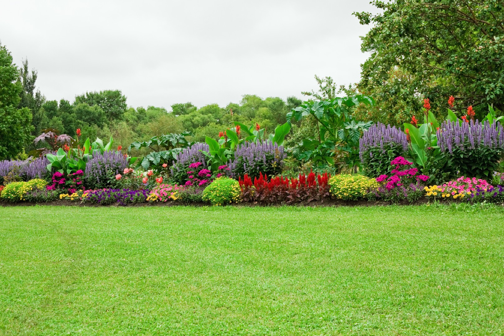
Understanding the impact of color on mood and perception is also crucial in landscape design. Different colors evoke different emotions and can create a specific atmosphere in your garden. For example, warm colors like red and orange are associated with energy and excitement, making them great choices for spaces where you want to encourage social interaction, such as an outdoor seating area. On the other hand, cool colors like blue and green evoke a sense of calm and tranquility, making them ideal for creating a peaceful oasis in your garden.
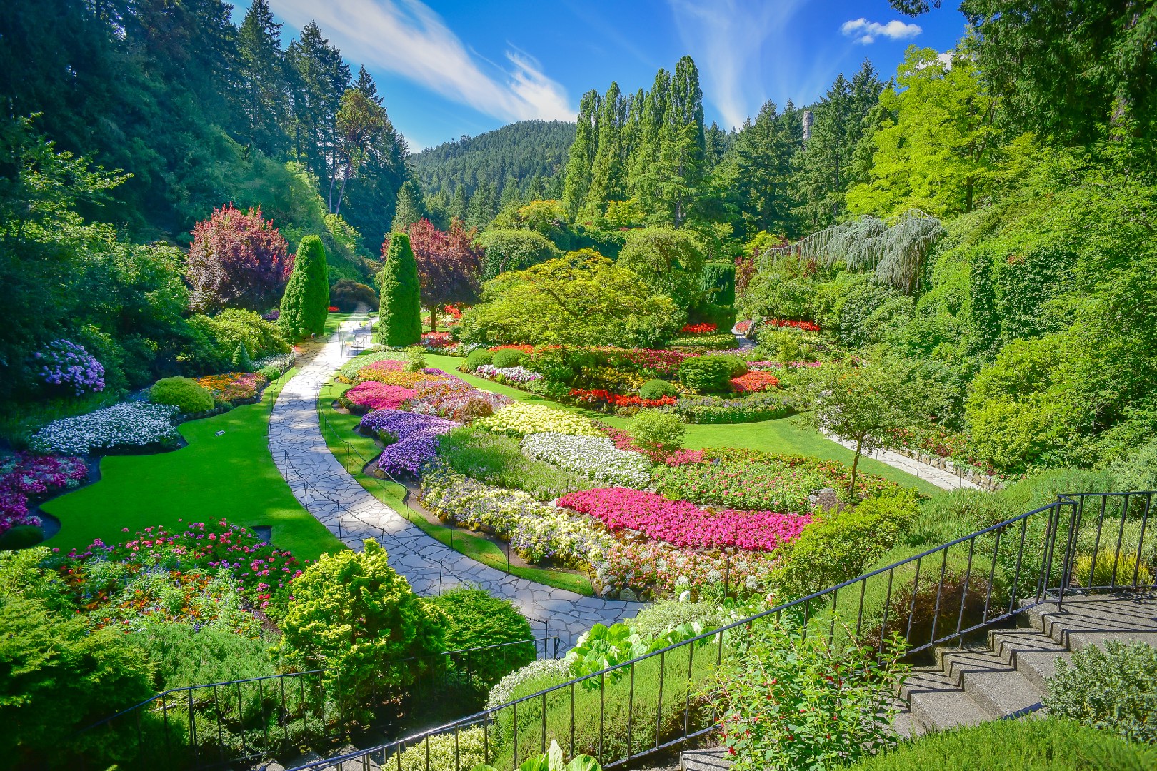
When applying color theory in landscape design, it is important to consider the overall theme or desired mood of your garden. If you want to create a visually stimulating space, you can use complementary colors, which are opposite each other on the color wheel, to create contrast and interest. On the other hand, analogous colors, which are adjacent to each other on the color wheel, can create a harmonious and soothing atmosphere.
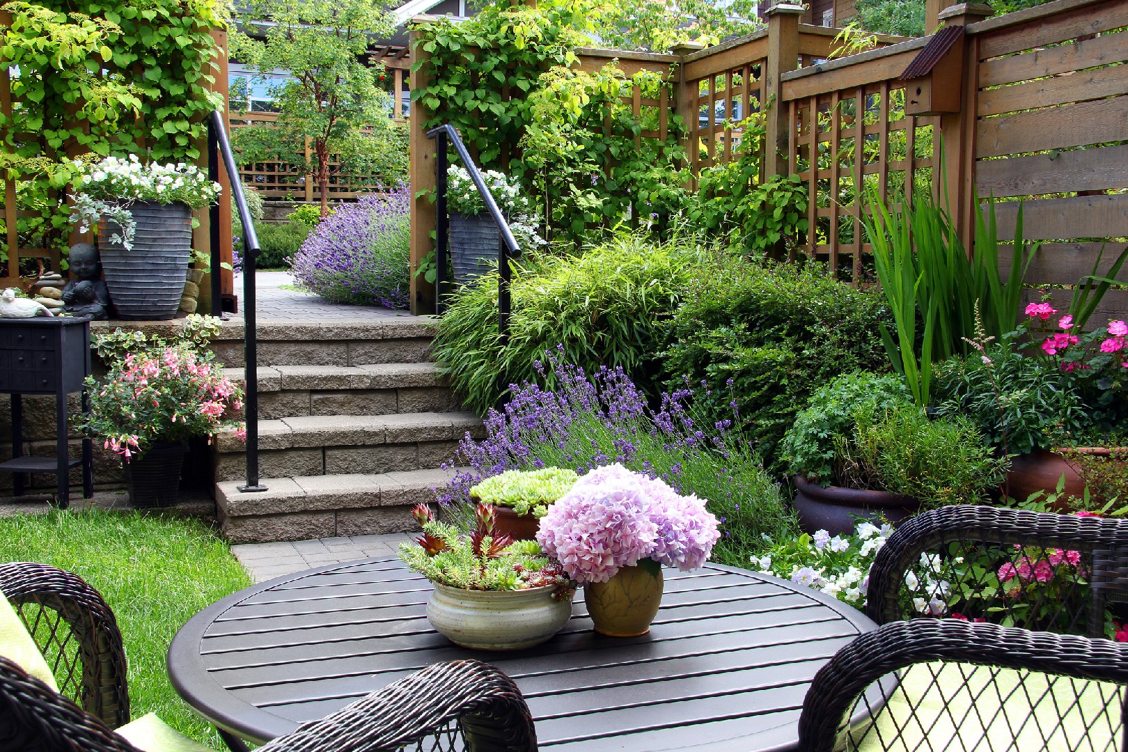
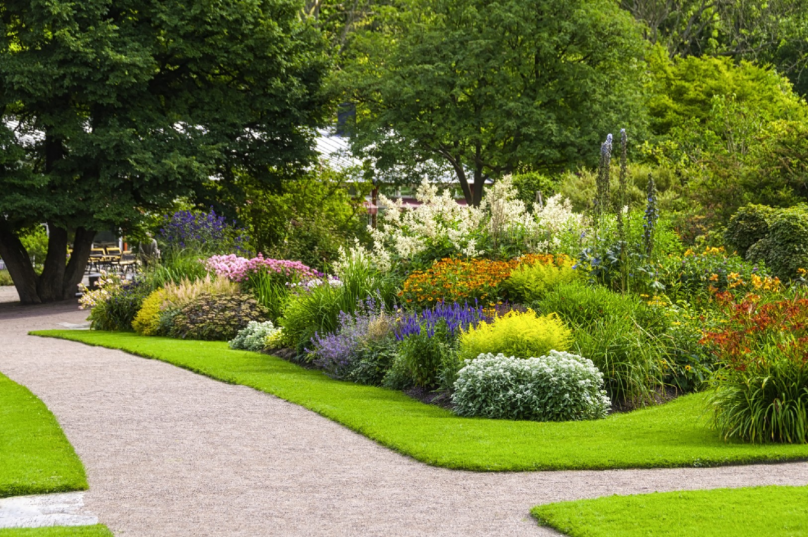
To make the most of color theory in your garden, consider incorporating different hues, saturations, and values of the same color to create depth and visual interest. Additionally, experiment with different color combinations and consider the surrounding environment, such as the color of nearby buildings or plants, to ensure a cohesive and pleasing design.
By understanding the fundamentals of color theory, you can confidently use nature's palette to paint your garden with vibrant and harmonious colors. Whether you want to create a lively and energetic space or a tranquil and serene oasis, color theory is a powerful tool that can elevate your landscape design to the next level.
Rectangle
Applying Color Theory in Landscape Design
Color theory plays a crucial role in landscape design, as it can greatly impact the overall aesthetic appeal and mood of a garden. By understanding the implications of color theory, you can make informed decisions when it comes to plant selection and arrangement in your garden.
One key aspect of color theory in landscape design is the use of color schemes. There are several color schemes that you can explore to create visually pleasing gardens. One popular color scheme is the monochromatic scheme, which involves using variations of a single color. This can create a sense of harmony and tranquility in your garden. Another color scheme is the analogous scheme, which involves using colors that are next to each other on the color wheel. This scheme creates a sense of cohesion and can be particularly effective in creating a natural and soothing atmosphere.
On the other hand, the complementary color scheme involves using colors that are opposite each other on the color wheel. This creates a vibrant and dynamic look in your garden, as the contrasting colors can create a strong visual impact. Lastly, the triadic color scheme involves using three colors that are equally spaced on the color wheel. This can create a vibrant and balanced look in your garden.
In addition to color schemes, it is important to consider the significance of seasonal colors in your garden. Different plants bloom and change colors at different times of the year, and by planning your garden to have year-round color, you can ensure that it remains visually appealing throughout the seasons.
To plan year-round color, you can start by selecting a variety of plants that bloom or change color at different times of the year. For example, you can choose plants that bloom in the spring, plants that have colorful foliage in the summer, and plants that have vibrant berries in the fall. This will create a dynamic and ever-changing color palette in your garden.
When arranging plants, consider their color, height, and texture to create a visually pleasing composition. For example, you can create a focal point by placing plants with vibrant colors or interesting textures in a prominent position. Additionally, you can use color to create depth and perspective in your garden. Warm colors like red, orange, and yellow tend to appear closer, while cool colors like blue and green recede, creating a sense of depth.
In conclusion, by applying color theory in landscape design, you can enhance the beauty and visual appeal of your garden. Consider the implications of color theory for plant selection and arrangement, explore different color schemes, and plan for year-round color. By doing so, you can create a garden that is not only visually stunning but also harmonious and inviting. So go ahead and paint your garden with nature's palette!
Rectangle
Color and Spatial Perception in Gardens
When it comes to landscape design, color plays a crucial role in creating a visually pleasing and harmonious space. But did you know that color can also alter our perception of space within a garden? By strategically using color, you can create depth and emphasize specific elements, making your garden feel larger or smaller depending on your desired effect.
One way to create the illusion of depth is by using cool colors in the background and warm colors in the foreground. Cool colors, such as blues and greens, tend to recede, while warm colors, like reds and yellows, appear to come forward. By painting the back of your garden with cool colors and placing warm-colored flowers or foliage in the front, you can create a sense of depth. This simple technique can make a small garden feel more spacious and expansive.
Another method to enhance spatial perception is through color blocking. By grouping plants with similar hues together, you can create visual boundaries that draw the eye to specific areas of the garden. For instance, if you have a large garden and want to create distinct zones, you can create a color block of purple flowers to demarcate a seating area. This not only adds structure to the garden but also makes it easier for visitors to navigate the space.
In addition to cool and warm colors, you can also incorporate complementary colors to create contrast and depth. Complementary colors are opposite each other on the color wheel, such as red and green or blue and orange. By placing these colors near each other, you can make them appear more vibrant and intense, adding visual interest to your garden. For example, a bold arrangement of orange flowers against a backdrop of blue foliage will create a striking focal point that draws attention.
When it comes to small gardens, using light and pastel colors can make the space feel more open and airy. These colors reflect more light, creating a sense of expansiveness. Consider planting white or pale pink flowers along the edges of your garden to create the illusion of width.
On the other hand, large gardens can benefit from bold and saturated colors. These colors can help fill the space and make it feel more intimate. Don't be afraid to experiment with deep purples, rich blues, or vibrant reds in larger areas of your garden. These intense colors can create a cozy and inviting atmosphere.
In conclusion, understanding how color influences spatial perception is essential in landscape design. By strategically using colors and employing techniques such as color blocking and using cool, warm, and complementary colors, you can manipulate the perception of space in your garden. Whether you have a small garden or a vast outdoor space, incorporating color theory into your design can transform your garden into a work of art that engages the senses and provides a visually appealing experience for all who visit.
Rectangle
Mastering the Art of Using Nature's Palette
When it comes to landscape design, one of the key elements to consider is color. Color can truly transform a garden, creating a mood, evoking emotions, and adding visual interest. By mastering the art of using nature's palette, you can create a harmonious and captivating outdoor space.
One method to effectively utilize color in your garden is by using different elements such as plants, flower beds, and furniture to manage color. Each element can contribute to the overall color scheme and create a balanced and cohesive look. For example, you can use vibrant flowering plants to add pops of color throughout the garden, while strategically placing furniture or decorative objects in complementary hues can enhance the overall visual impact.
Another important factor to consider is how lighting conditions impact color and how to choose colors that work well in different light conditions. Natural light changes throughout the day, casting different hues and shadows on your garden. Understanding how to work with these lighting variations can help you make informed color choices. For instance, if your garden receives a lot of direct sunlight, it's best to choose colors that can withstand bright, intense light without fading. On the other hand, if your garden is mostly shaded, opting for brighter colors can help create a more lively and vibrant atmosphere.
To illustrate the power of color in landscape design, let's take a look at a case study of an expertly designed colorful garden. This garden features a variety of vibrant flowers, carefully selected to create a harmonious color palette. The designer has cleverly arranged the flowers in different heights and groupings, creating a visually dynamic and captivating display. By using a combination of warm and cool colors, the garden feels inviting and balanced. Additionally, the designer has incorporated contrasting colors to add visual interest and create focal points throughout the space. The result is a garden that is both visually stunning and inviting to explore.
In conclusion, mastering the art of using nature's palette can elevate your landscape design to a whole new level. By utilizing different elements of the garden, understanding how lighting conditions impact color, and studying expertly designed gardens, you can create a visually captivating and harmonious outdoor space. So, go ahead and paint your garden with nature's palette, and watch it come to life with vibrant colors and beauty.
Painting with All the Colors of Nature
By viewing your garden as a blank canvas and nature's palette at your command, you can master the application of color theory in landscape design, creating a space that is not only aesthetically pleasing but also a mirror of the vivid hues and emotions that nature has to offer.
Frame
Conclusion
Line
Cookie Management Tool
In addition to managing cookies through your browser or device, you can change your cookie settings below.
Necessary Cookies
Necessary cookies enable core functionality. The website cannot function properly without these cookies, and can only be disabled by changing your browser preferences.
Analytical Cookies
Analytical cookies help us to improve our application/website by collecting and reporting information on its usage.
Cookie Name Source Purpose Lifespan
_ga Google Analytics These cookies are set because of our use of Google Analytics. They are used to collect information about your use of our application/website. The cookies collect specific information, such as your IP address, data related to your device and other information about your use of the application/website. Please note that the data processing is essentially carried out by Google LLC and Google may use your data collected by the cookies for own purposes, e.g. profiling and will combine it with other data such as your Google Account. For more information about how Google processes your data and Google’s approach to privacy as well as implemented safeguards for your data, please see here. 1 Year
_pta PictureThis Analytics We use these cookies to collect information about how you use our site, monitor site performance, and improve our site performance, our services, and your experience. 1 Year
Cookie Name
_ga
Source
Google Analytics
Purpose
These cookies are set because of our use of Google Analytics. They are used to collect information about your use of our application/website. The cookies collect specific information, such as your IP address, data related to your device and other information about your use of the application/website. Please note that the data processing is essentially carried out by Google LLC and Google may use your data collected by the cookies for own purposes, e.g. profiling and will combine it with other data such as your Google Account. For more information about how Google processes your data and Google’s approach to privacy as well as implemented safeguards for your data, please see here.
Lifespan
1 Year

Cookie Name
_pta
Source
PictureThis Analytics
Purpose
We use these cookies to collect information about how you use our site, monitor site performance, and improve our site performance, our services, and your experience.
Lifespan
1 Year
Marketing Cookies
Marketing cookies are used by advertising companies to serve ads that are relevant to your interests.
Cookie Name Source Purpose Lifespan
_fbp Facebook Pixel A conversion pixel tracking that we use for retargeting campaigns. Learn more here. 1 Year
_adj Adjust This cookie provides mobile analytics and attribution services that enable us to measure and analyze the effectiveness of marketing campaigns, certain events and actions within the Application. Learn more here. 1 Year
Cookie Name
_fbp
Source
Facebook Pixel
Purpose
A conversion pixel tracking that we use for retargeting campaigns. Learn more here.
Lifespan
1 Year

Cookie Name
_adj
Source
Adjust
Purpose
This cookie provides mobile analytics and attribution services that enable us to measure and analyze the effectiveness of marketing campaigns, certain events and actions within the Application. Learn more here.
Lifespan
1 Year
This page looks better in the app
Open